Task Success:Overall completion rate is 75%,with experts completing all tasks and novices encountering difficulties in tasks 2 and 3.
Project Overview:The current Skype platform focuses primarily on communication, lacking features that foster social interaction and engagement among team members. This leads to challenges in collaboration, information sharing, and building a sense of community, ultimately affecting team productivity and morale. Metrics: Timeline: |
Team:Product Managers: 2 members
Developers: 22 members
UX Researchers: 5 members
Marketing Specialists: 4 members
UI/UX Designers: 6 members
Key Responsibilities:Responsibilities include conducting user research, creating user journey maps, and developing wireframes and prototypes. The role involves designing user-friendly interfaces, collaborating with teams, iterating on designs, preparing specifications, and maintaining a design library while staying updated on industry trends.
Deliverables: |
Skype is a communication platform that allows users to make voice and video calls, send instant messages,
and share files over the internet, enabling global connectivity and real-time interaction.
The reason behind our adoption of Skype was the observation of its decline in the face of strong competition.
We endeavored to understand the various challenges and drawbacks associated with this decline through the
application of cognitive methods. Our goal was to revitalize and enhance the interface and user experience of Skype.


The purpose of the Hierarchical Task Analysis (HTA)is to comprehensively understand the flow of the application and the various methods available to achieve the same goal.
Taking insights and observing patterns from the Information architecture we laid down some tasks to make the HTA, The task being -To onboard Skype and chat with the most recent contact.
Multiple steps or options were observed for achieving the same outcome, such as searching for a contact, potentially causing user confusion.
Novice users initially find the task difficult due to the presence of multiple steps, but with time and familiarity, it becomes easier to understand and navigate.
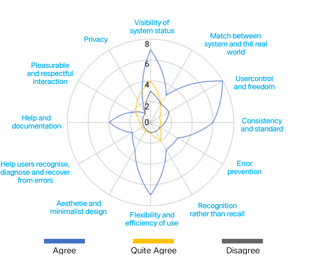
“ The Heuristic Evaluation is utilised to identify problems in the user interface design using usability principles. ”
While analyzing 108 heuristics and severity rating heuristics we found out that Usercontrol and freedom is not up to the mark as novice users will find it difficult to use the app due to similar icons used for different functionalities This shows how the system is inconsitent Skype has minimalist design.
“Usability metrics are quantitative measures used to assess the usability of a product or service. These metrics provide valuable information about how easily and effectively users can interact with a product or service and how satisfied they are with their experience.”
Effectiveness:The accuracy and completeness with which users achieve specified goals. |
Efficiency:The resources expended in relation to the accuracy and completeness with which users achieve goals. |
Satisfaction:The comfort and acceptability of use. |
1Open Skype-Go to a chat and create a new group with them. |
2Go to your profile and change video language to Spanish. |
3Put a virtual background for a video call and sign out. |
“ Effectiveness is the measure of how accurately and completely users achieve their goals. It is calculated
using the completion rate, where ‘I’ represents successful completion and ‘0’ represents failure.”
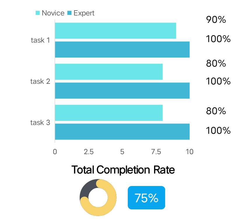
Task Success:Overall completion rate is 75%,with experts completing all tasks and novices encountering difficulties in tasks 2 and 3.
User Proficiency: Novices faced navigation problems and couldn’t complete the tasks, while experts successfully completed all tasks, highlighting the impact of experienceon navigation ease. This indicates that the novice
Learning Curve: The learning curve appears steep for novices, with limited improvement in proficiency and learning over time.
“Time-based Efficiency is utiised to measure the efficiency of completing tasks, ie, task completion time.”
Task 1- Confused search bar with group heading and got mislead
Task 2- Clicked on the main profile then on Skype profile rather than going to settings
Task 3 – Can’t find the virtual background, frustrated and got confused with Skype profile but then went to appearance in settings instead of audio and video and then lost hope and gave up
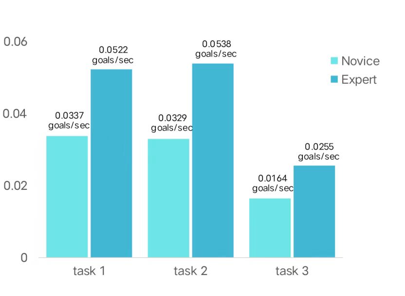
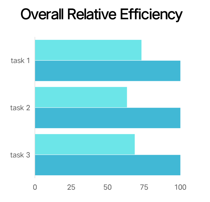
These findings suggest that experts demonstrate higher effectiveness due to their familiarity with the system, while novice users require more time to navigate through the app and complete tasks.
Additionally, it was observed that novice users exhibited higher error rates, particularly in areas such as the placement of settings an adding participants. These findings indicate the need for adjustments to minimise mistakes and improve over all task effectiveness in these specific areas.
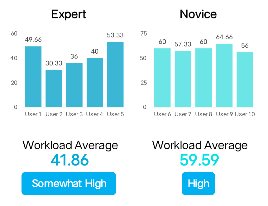
“The System Usability Scale(SUS)is employed to measure subjective user opinions and to validate the accuracy of the results.”
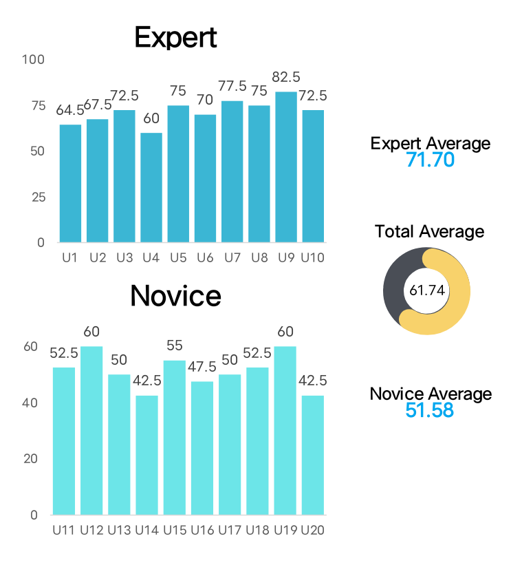
The overall System Usability Scale score is 61.74, indicating a slightly above-average score. This suggests that there is room for slight improvement in the navigation of features within Skype.
Looking at the novice graph, it is evident that the scores are lower, indicating a steeper learning curve and difficulty in navigating the app for novice users.
In comparison, the scores for experts are higher indicating a better understanding of the app and interface after learning and using it for certain period of time.
“Hicks’s Law “Hick’s Law examines the relationship between the number of stimuli present and the user’s reaction time.”
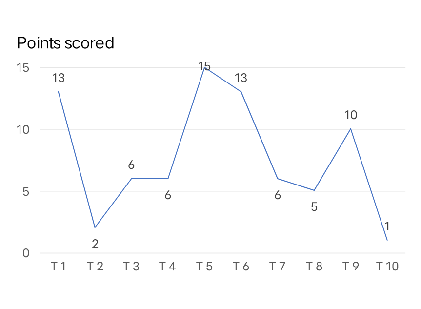
Four tasks were found to have a high number of stimuli.
Task 9 had a justifiable number of stimuli as the task involved changing the appearance which is a secondary function.
However,in tasks 6,5,and 1,which were primary functions (changing status to “Do Not Disturb,” adding a participant, and signing out, respectively),multiple stimuli were leading to slower decision-making and potentially decreased efficiency of the user.
“Fitt’s Law is used to examine and reduce the distance required to travel as the user navigates through the interface.”
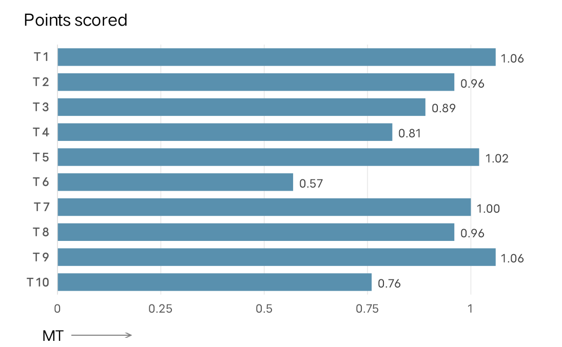
Four tasks were found to have higher movement time.
Task 5had ajustifiable movement time asthe task involved reacting to a message which is a secondary function.
However,in tasks 6,5,and 1,which were primary functions (changing status to “Do Not Disturb, “adding a participant, and signing out, respectively),multiple stimuli were leading to slower decision-making and potentially decreased efficiency of the user.
“The NASA Task Load Index (TLX) is employed to assess the subjective mental workload experienced by users while using the application.”
Common factors observed in both groups included experiencing frustration, mental demand, and exerting effort while navigating through the application.
This observation can be attributed to the presence of multiple pathways to access the same function, as well as the scattered arrangement of features, rather than having them consolidated in one place.
“Cognitive walkthrough is a method for inspecting usabiity that involves a team walking through a task flow and answering a set of questions to identfy interface aspects that may be challenging for new users. In the case of the Skype application, a cognitive walk through was performed for B tasks to identify usability is ues and evaluate the application’s ease of use for new or infrequent users. The 8 major tasks were broken down into subtasks and evaluated by answering a set of questions for each subtask.”
| 12 | Will the user try to achieve the effect that the subtask has?Will the user notice that the correct action is available? | 34 | Will the user understand that the wanted subtask can be achieved by the action?Does the user get appropriate feedback? |
|
1 MAIN TASK: Schedule A Call Sub TASK1: Click on the Contacts button in the panel on the left Sub TASK2: Click on the recent call Sub TASK3: Click on the meatball menu Sub TASK4: Click on the recent call |
Insights-the text fields in thepopup are already filled in and send button is also active which leads to confusion amongusers. |
2 MAIN TASK: Add A New Contact Sub TASK1: Click on the Contacts button in the panel on the left Sub TASK2: Press the new contact option Sub TASK3: Type in the name of the contact that has to be added Sub TASK4: Select the required contact with the help of search results |
Insights-The “add a new contact” button is readily discernible to the user, cand upon activation, the resulting pop-up is sufficiently explicit and precise, ccatering even to a novice user’s comprehension of distinct alternatives. After successfully adding a contact, the user can distinctly perceive the label “added” preceding the individual’s name, and the contact appears on the taskbar located on the left-hand side. |
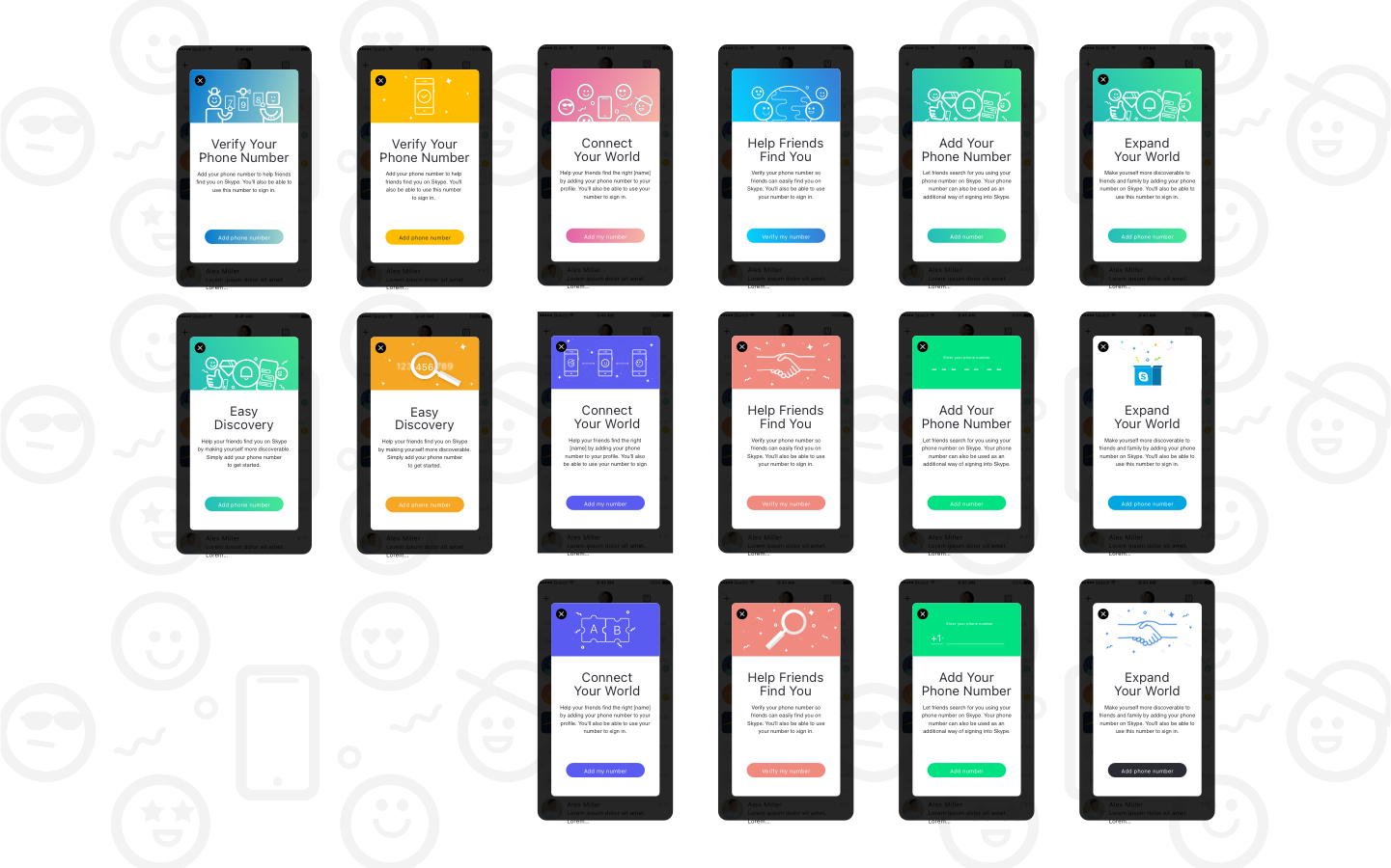
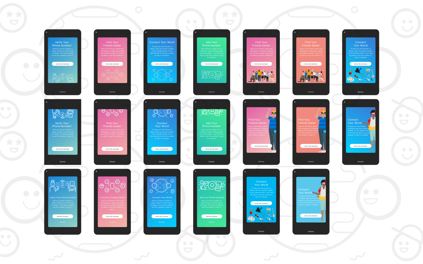
“Law of affordance states that objects or interface should provide clear clues for intuitive interaction.”
During the analysis of the law of affordance, we observed a lack of consistency in the system. Specifically, the same icons were used for different functions, and vice versa.
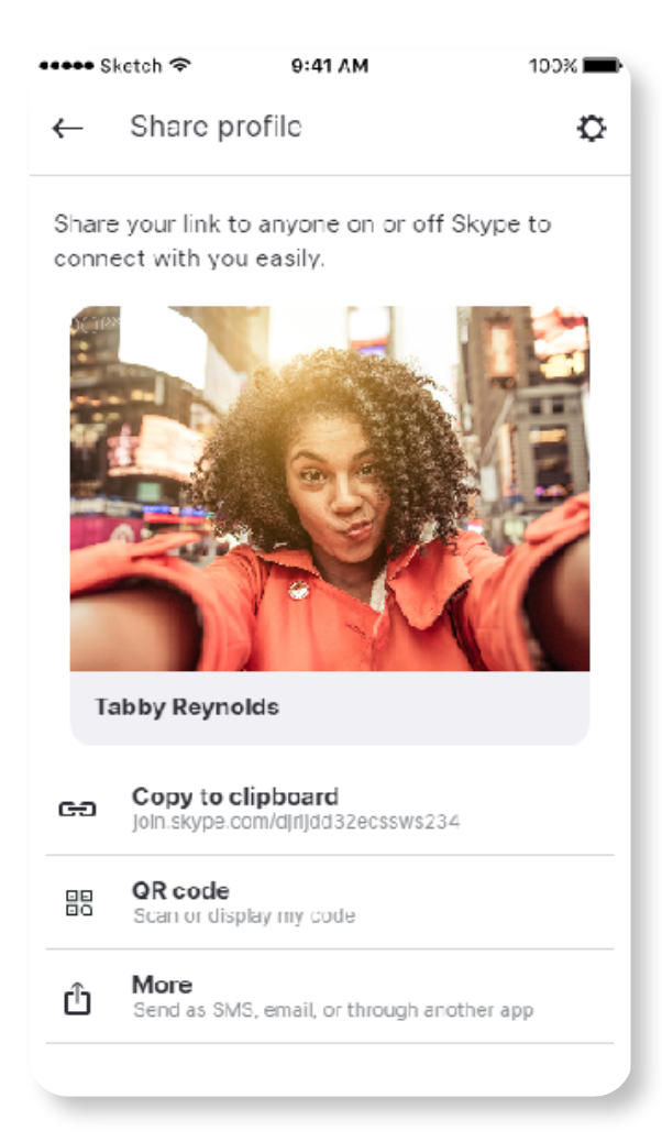
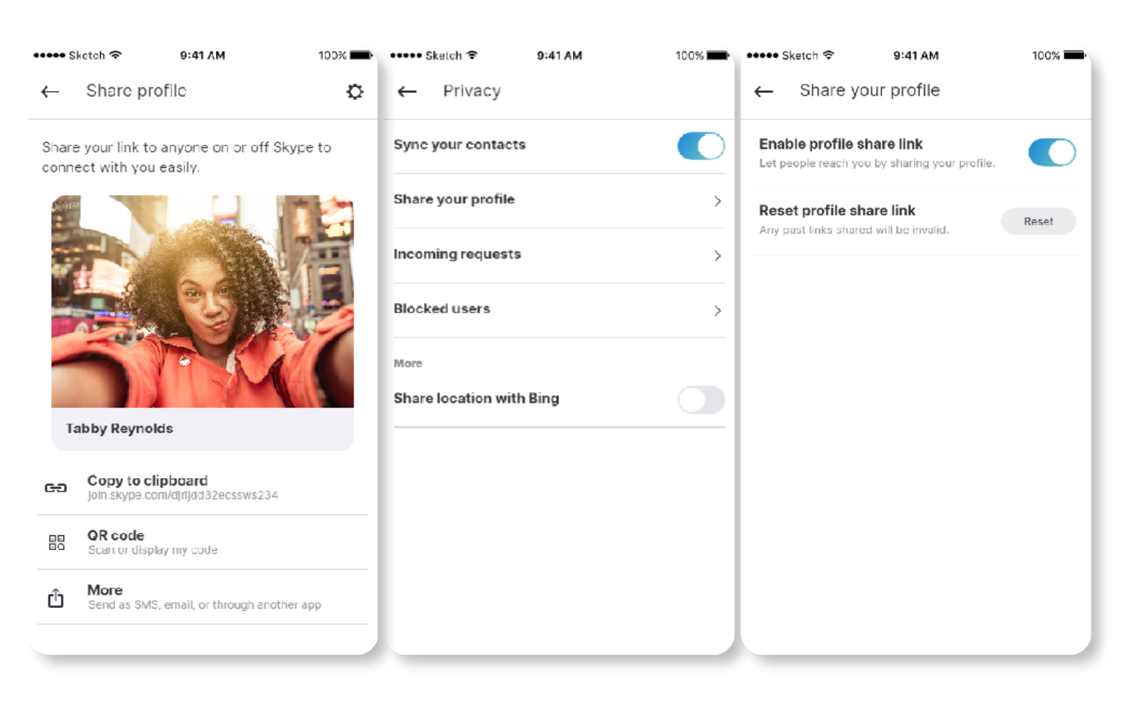
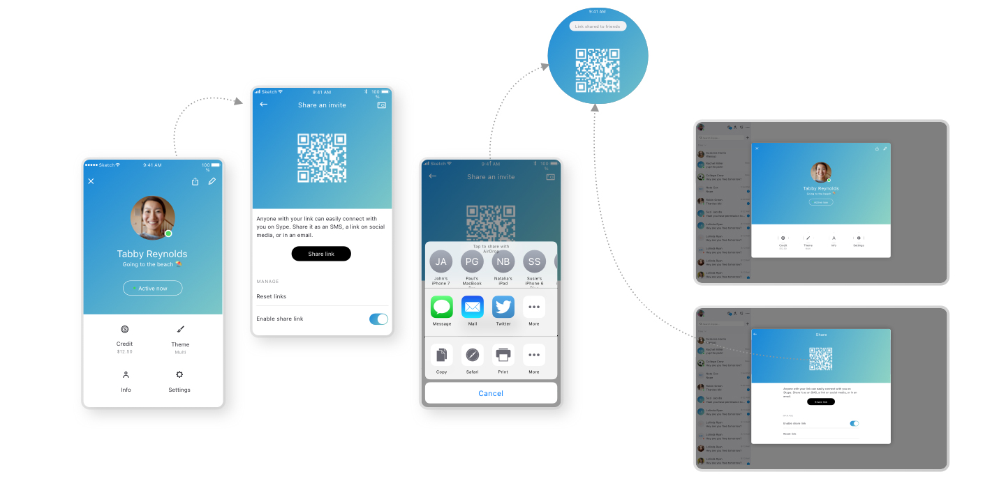
QR drill-in, Show URL

|
OPTION1 No Settings Most minimal. This option does not have link enable/disable and link reset. |
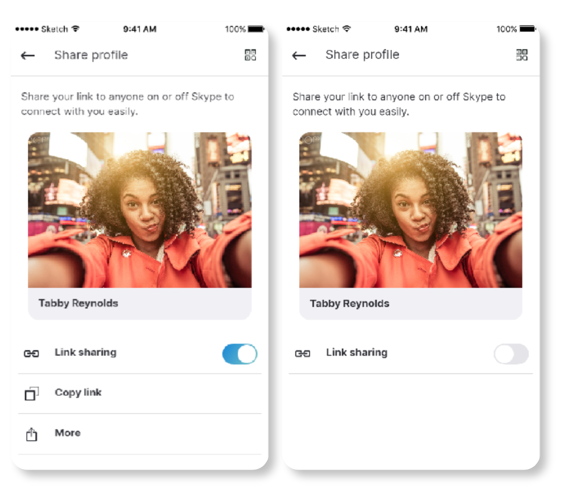
SCENARI01 My Share Link |
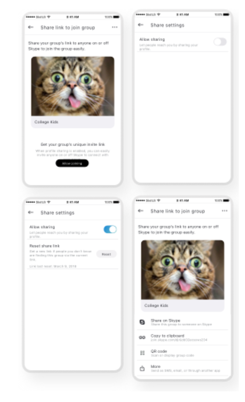
SCENARI02 Group Share Link |
|
OPTION2 Settings in Privacy User goes into Settings> Privacy to manage their profile share link, keeping their share profile screen minimal. |
SCENARI01 My Share Link |
SCENARI02 Group Share Link N/A Link management for groups should logically be located within each group as oppose to the user’s Settings section.v |
|
OPTION3 No Link Reset Consider keeping profile sharing 1-level deep by surfacing the link sharing toggle to the Share Profile view, which enables and disables the share options below it. |
SCENARI01 My Share Link |
SCENARI02 Group Share Link |
|
OPTION4 Maximum Link Management This option has the most amount of share link management capabilities by including link enabling/disabling as well as link reset. |
SCENARI01 My Share Link |
SCENARI02 Group Share Link |
|
|
|
Revamped group call screen
|